SECURITY IS EVERYONE’S REPONSIBILITY.
I do a lot of work with the information security/hacking worlds. I’ve been working in this weird little space since 2011. I’ve made a lot of fun graphics, for conferences, hackathons, keynotes, shirts, posters,socks, coffee warmers, badges, murals, installations, and all sorts of other bonkers things for this world. It has become part of my visual vocabulary, but most people associate me with the rock stuff.
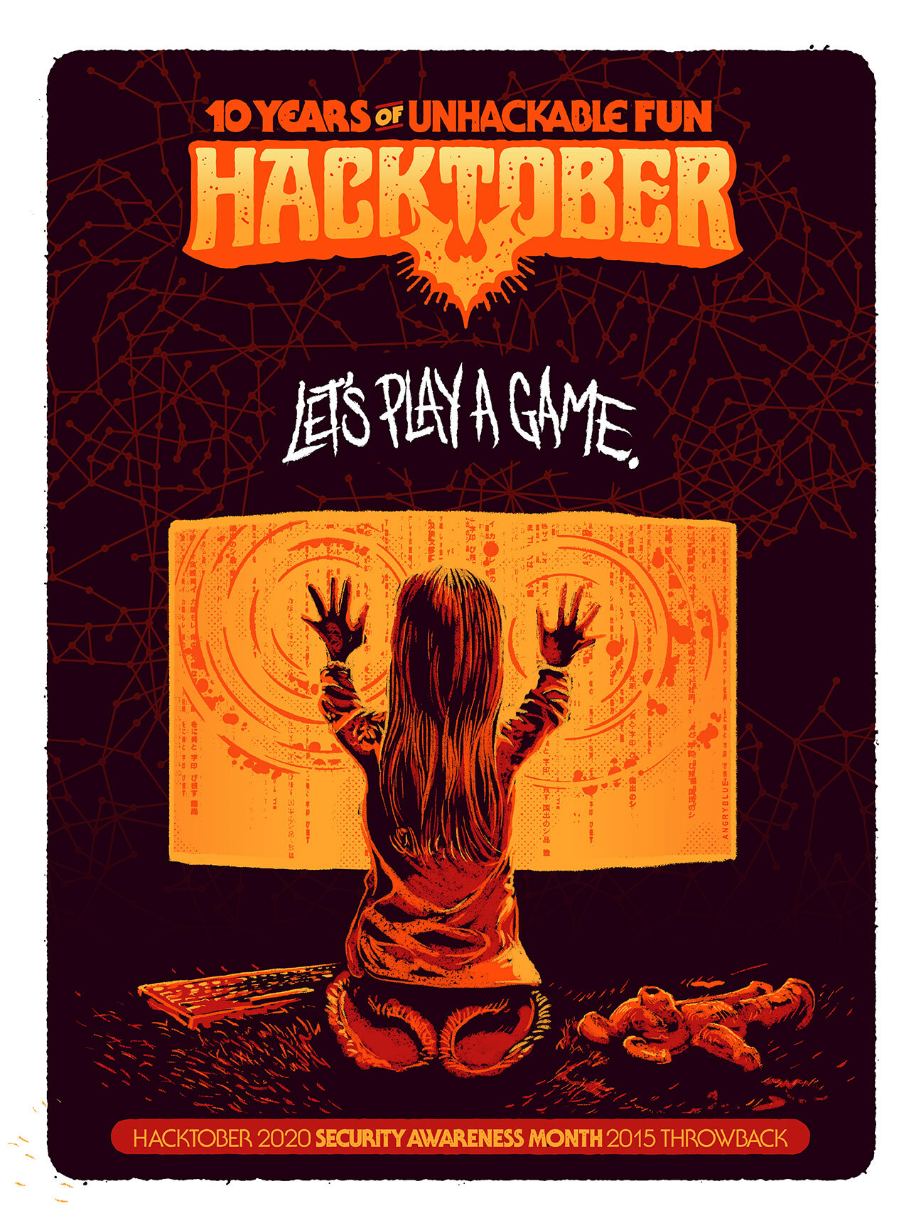
One of my favorite recurring projects is for Facebook with Hacktober since its inception. This year’s graphics are some of my favorites ever.
NOTE: I'm waiting to post this year's graphics because they should roll that stuff out on their own terms
In 2011 a friend from Facebook wanted to build Hacktober and we started building the inception or template for it then and I've been assisting with its evolution since.
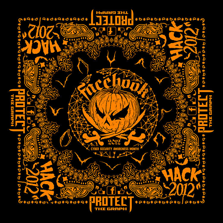
The original design and needs were incredibly simple when we started. We just wanted a Hack-O-Lantern and were very literal with the idea having the word "HACK" be the mouthpiece through the filter of Halloween. The idea was to make a fun keepsake that would be pretty different on campus for security awareness. We screenprinted those and did a clear glossy coat of 'The Graph' on top that you could see depending on how the light is pointed at it.
Really, part of the idea was to make fun apology swag for the Facebook campus because from what I understand, the security team was sending people links, leaving out flash drives and discs with the impression that it was a bootleg of a new album by someone cool at the time and then it would end up doing something really annoying to their computer to RickRoll them with the intention of ...DON'T DO THAT. EVER. And just trying to be aware of what their responsibilities are to the users to encourage safety, security while building a community reminder. Additionally:
We always wanted to make something that would resonate and hopefully be fun at the same time.
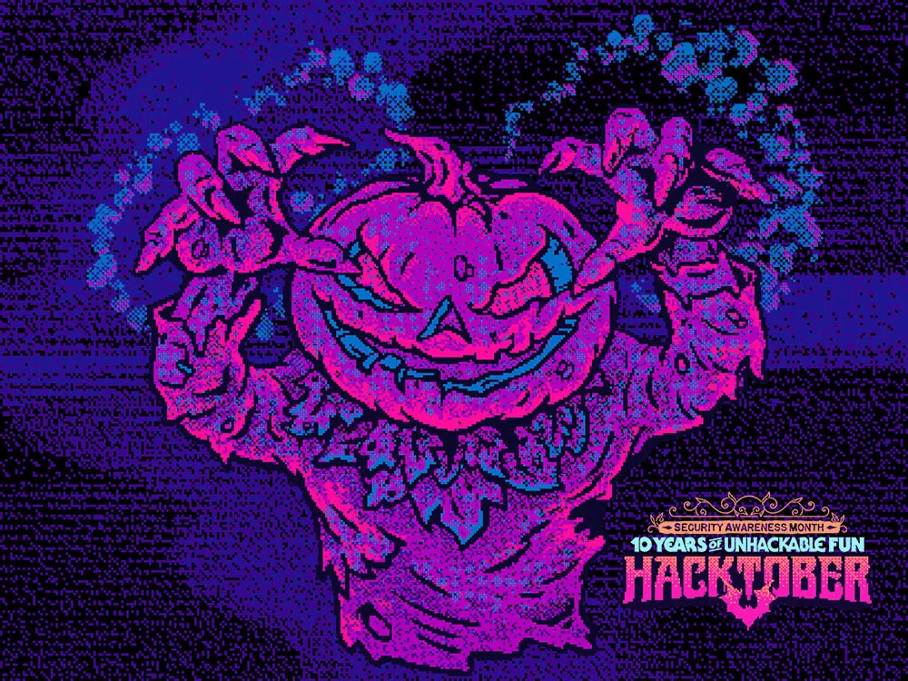
Each year, I've gotten the opportunity to come back to drawing spooky pumpkins with the overall background being some of my favorite influences. Those would be Halloween decorations from the 30's through 50's and mixing that specific flavor of illustration into pop culture movies that are part of what made Halloween really wonderful to me through the 80's and 90's whether it was horror movies, punk rock or the fun vibe of the Simpsons Treehouse of Horror episodes each year.
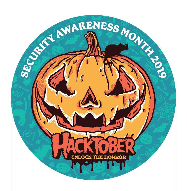
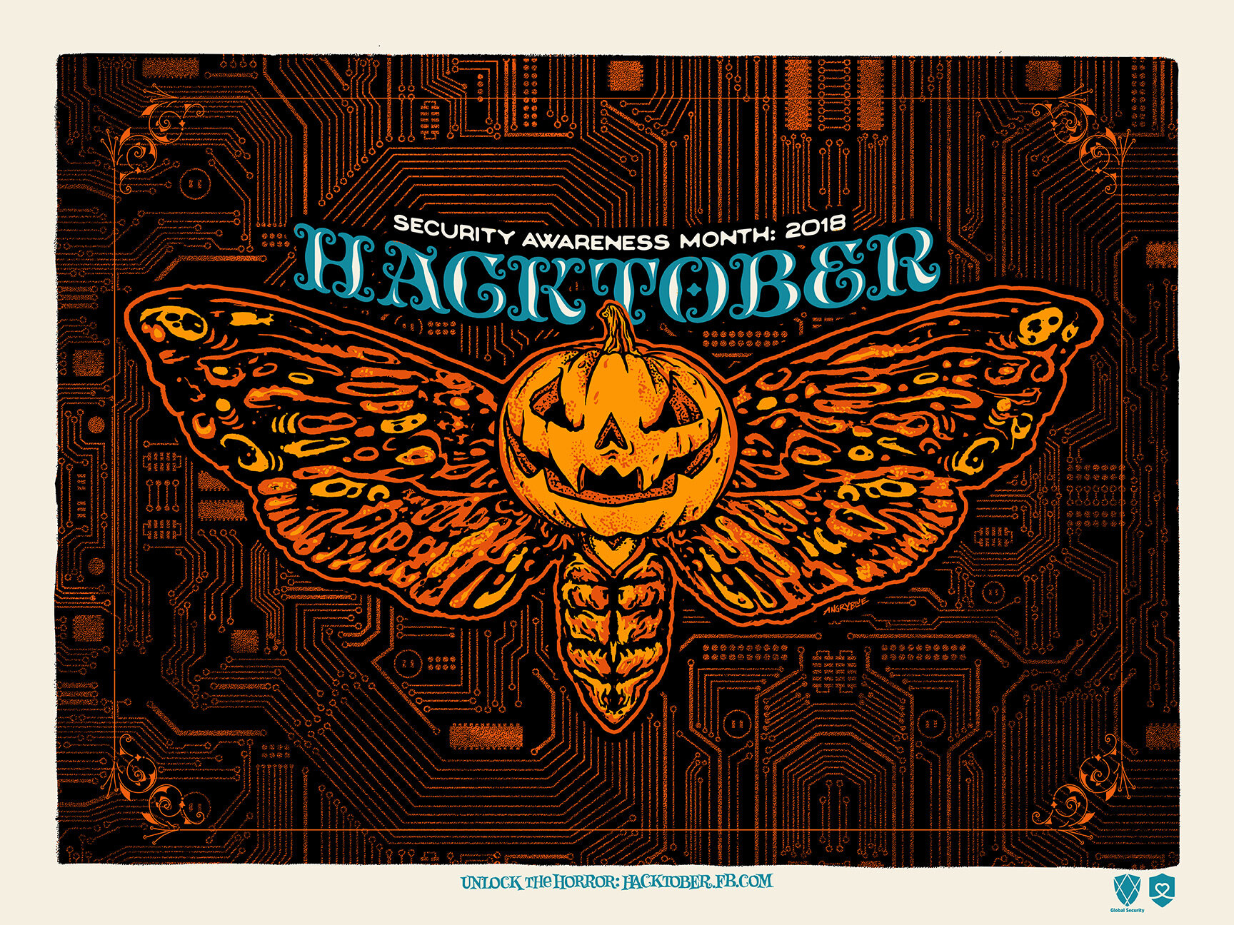
Some favorite designs:
One year, I had one of these miniature pumpkins on my porch and decided to cut it apart so I could fit some of those cheap vampire fangs into it and that's been a favorite thing to come back to every once in a while. I've made enamel pins out of some of those designs and it's always been great to use for posters and prints.
For year 5, we got to start being a little self-referential and re-using things we'd started defining as our main character which is the pumpkin-headed monster in a spy-vs-spy sort of way with the monsters hiding a gift of a trojan horse or a bug bomb behind their backs with a little collage using a bunch of the items together, for the primary poster using the graph and glossy printing again.
I look forward to many more Hacktobers.

