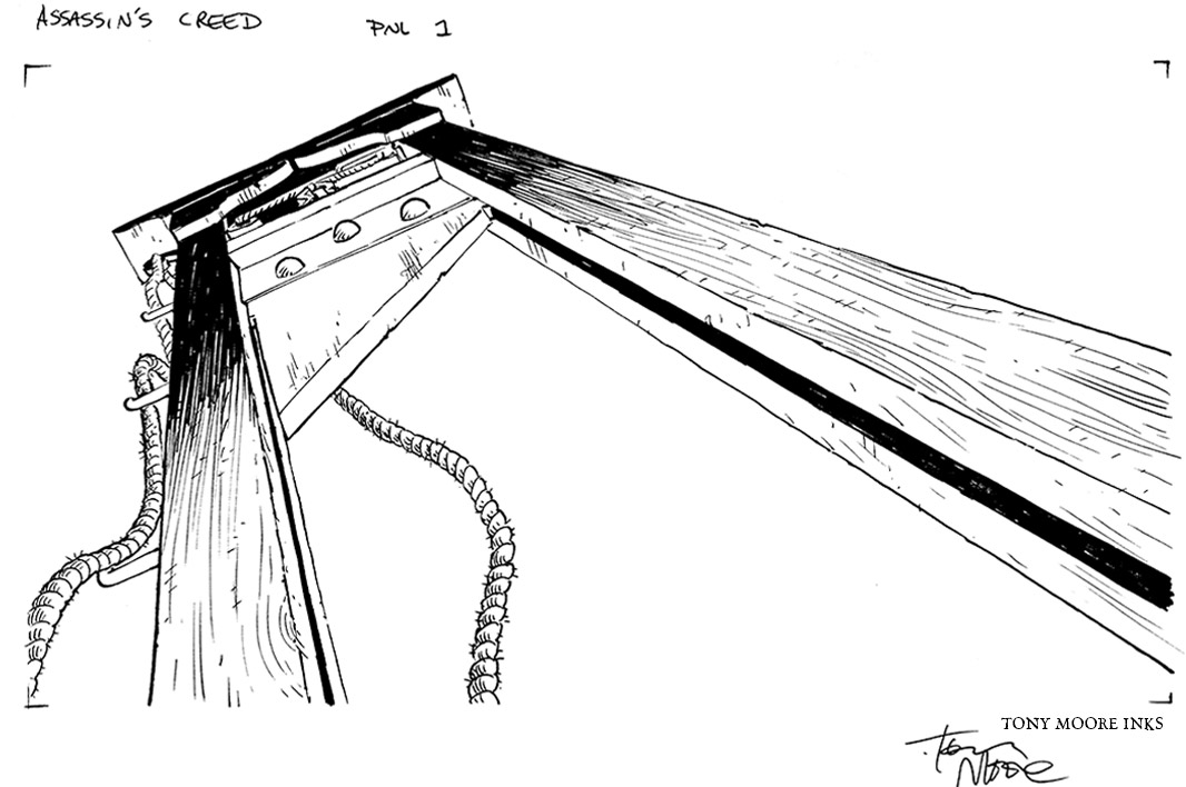
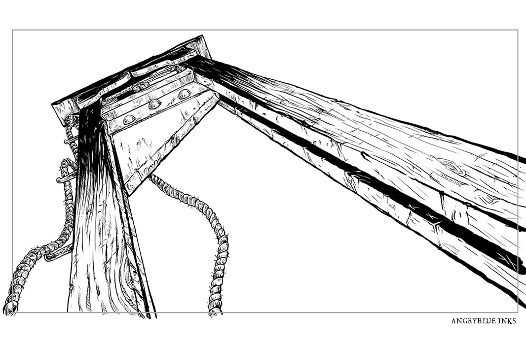
In 2014 , I worked on some stuff with my friend Tony Moore, John Rauch & Rob Zombie for Assassin’s Creed: Unity.
New Science Agency called me up and wanted to animate some of my work. I thought this sounded amazing and then remembered, “I don’t do sequential illustration” and went on to say, “I don’t want to talk myself out of a job, but I know someone I might be able to collaborate with to make this work” and got Tony on the phone.
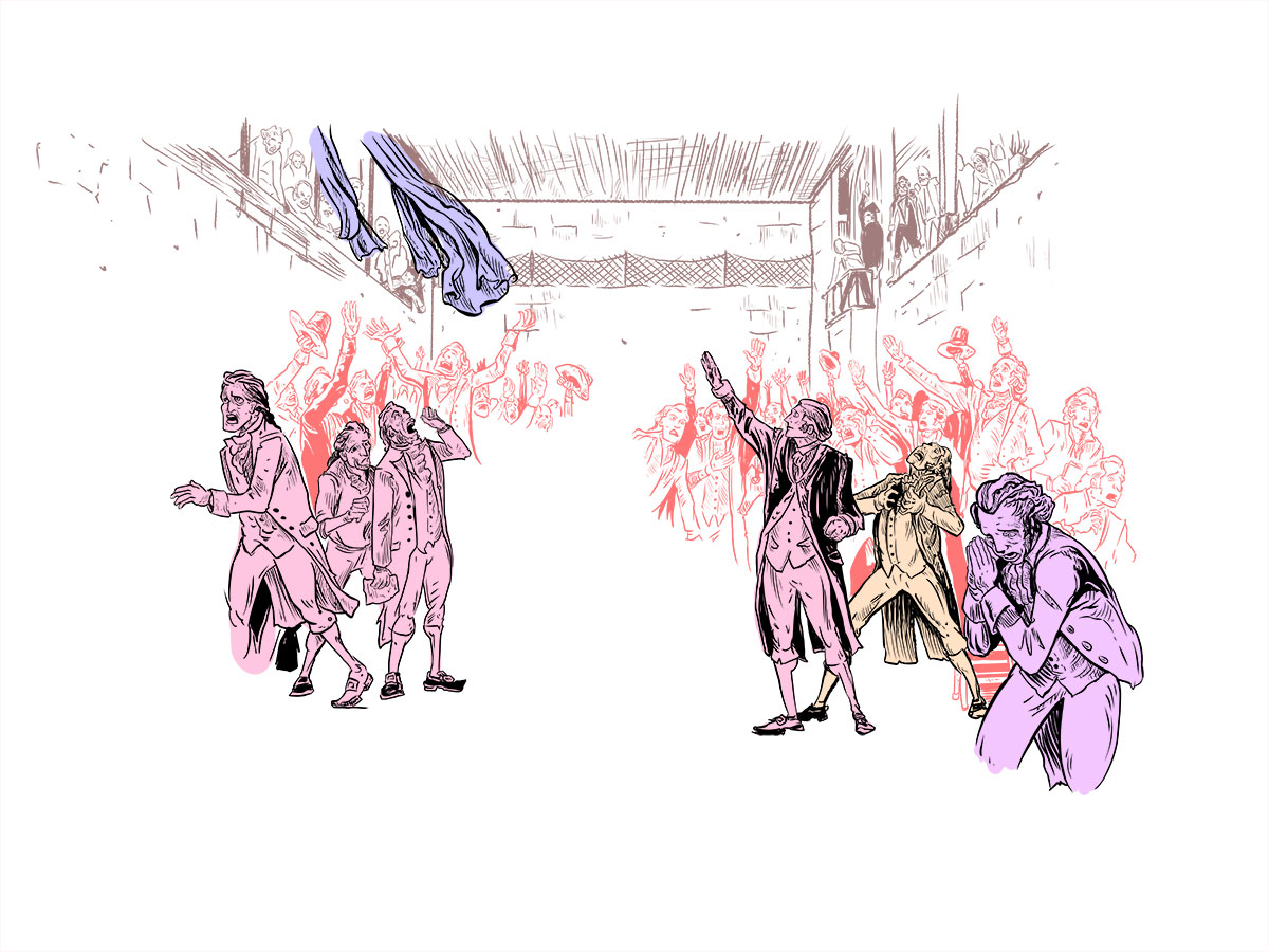
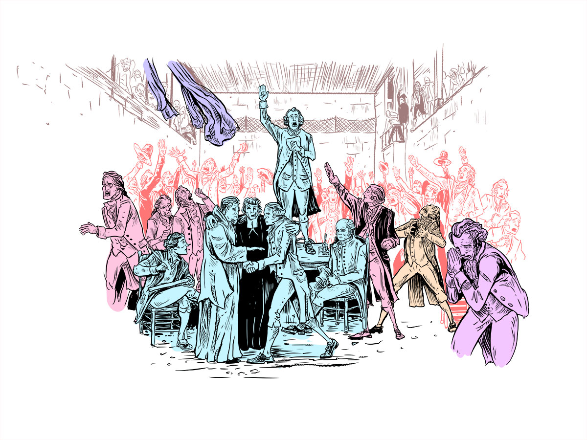
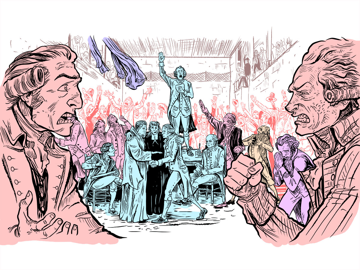
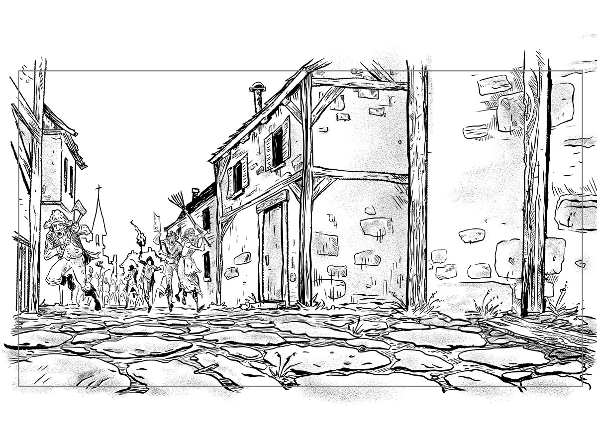
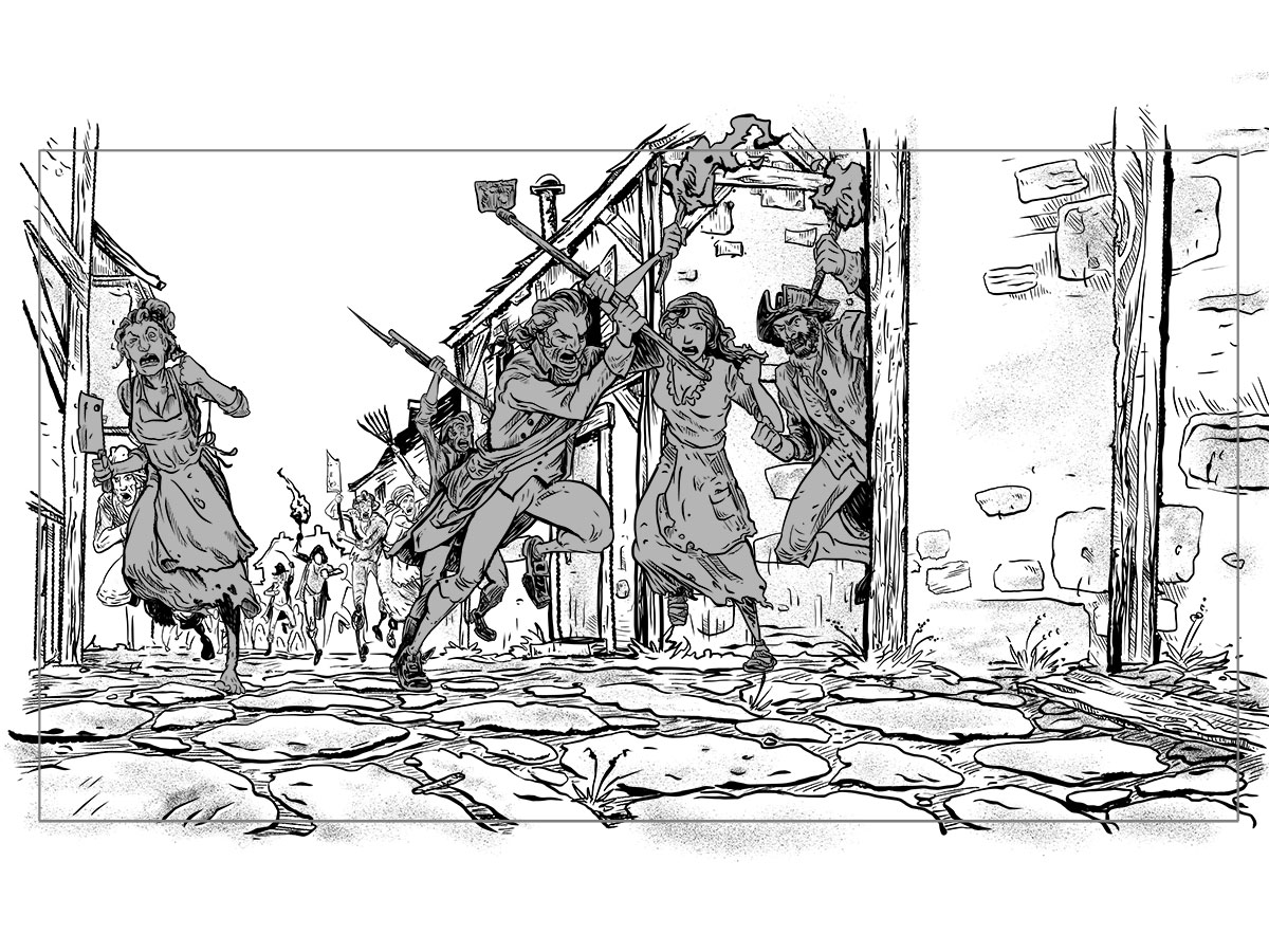
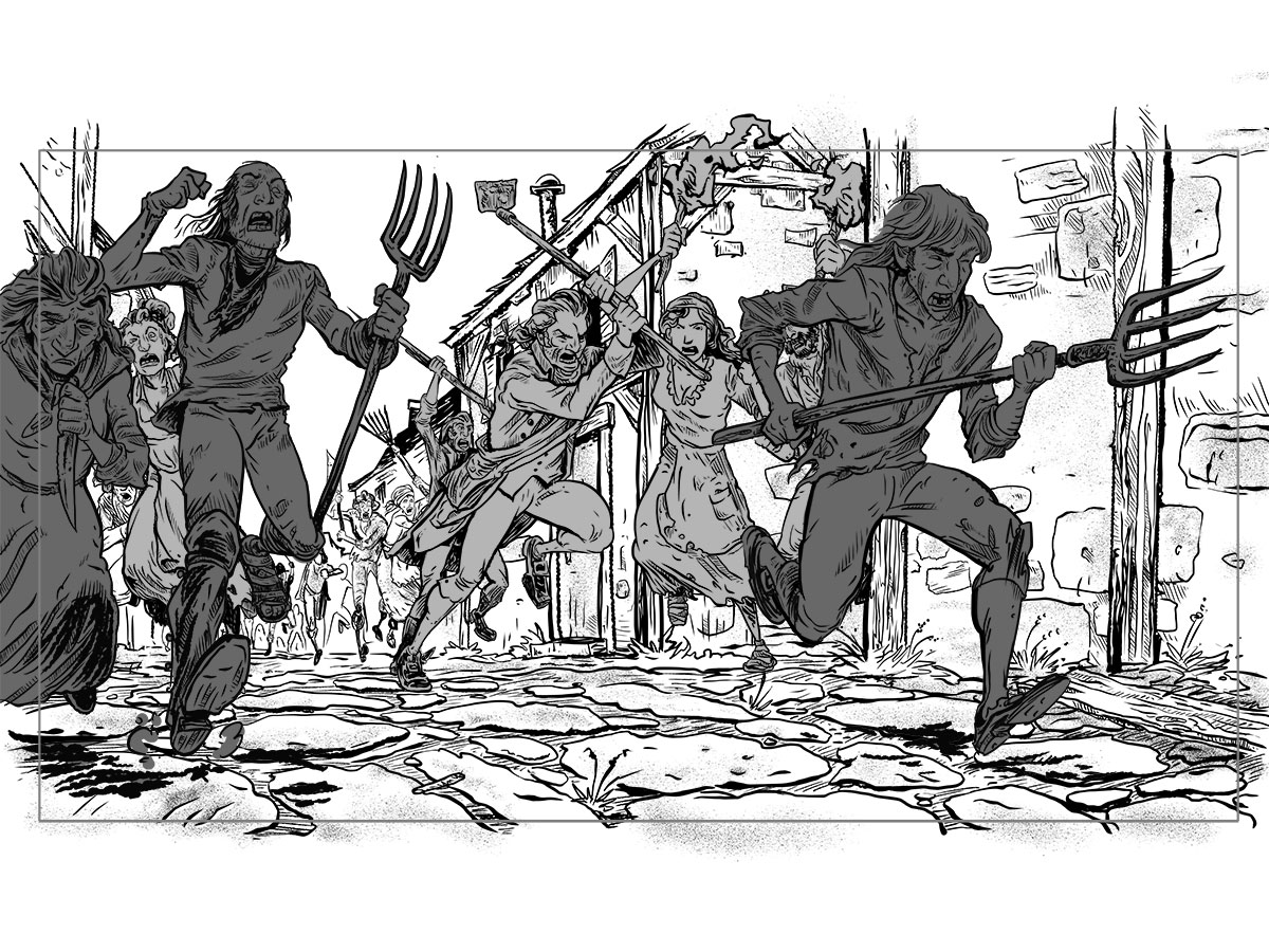
Inspired by Ubisoft’s ‘Assassin’s Creed Unity’, New Science produced an animated short film which debuted at Comic-Con 2014 before a sold-out crowd. Set in the French Revolution, the story was re-imagined by musician / director Rob Zombie and featured the illustrative works of Tony Moore, co-creator of The Walking Dead. Together, we crafted a film which highlights the chaos and brutality of the French Revolution, painting the streets of Paris red with blood.
The film generated over 300,000 views on YouTube in the first 48 hours of its release; and within minutes of its debut, features hit the web on Rolling Stone, SPIN, Variety, Game Informer, IGN, GameSpot, Blabbermouth, Loudwire, and many others.
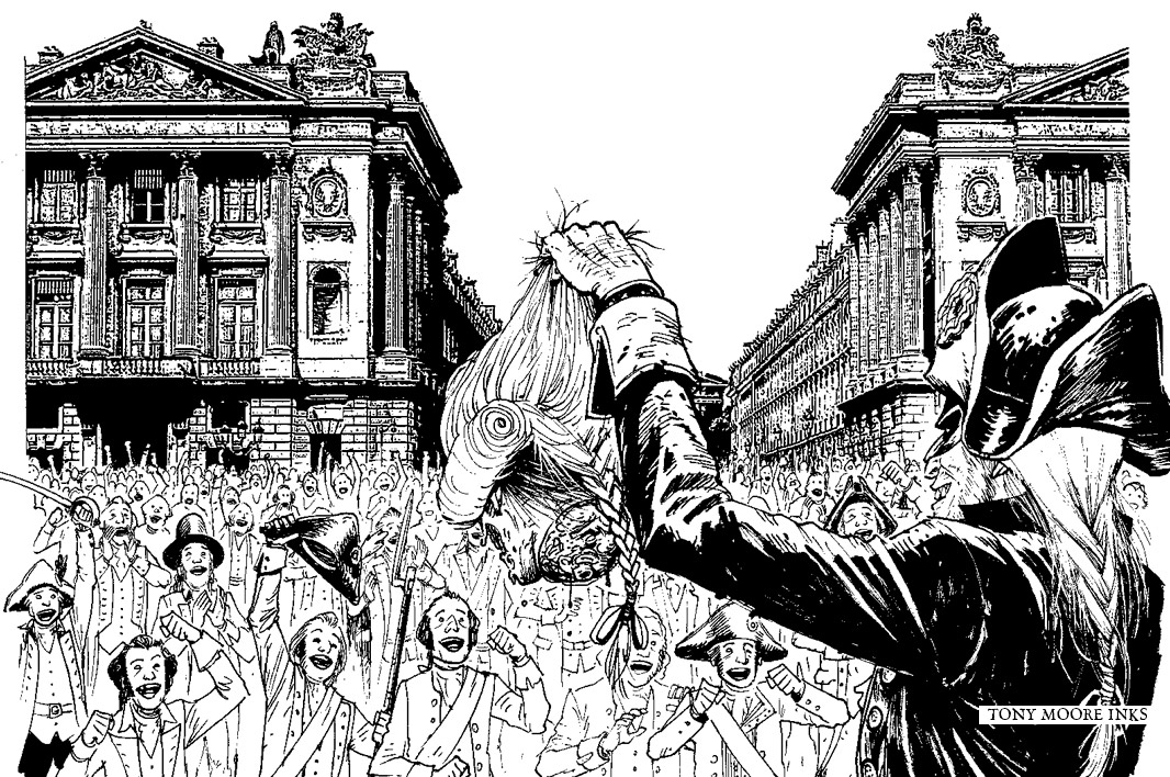
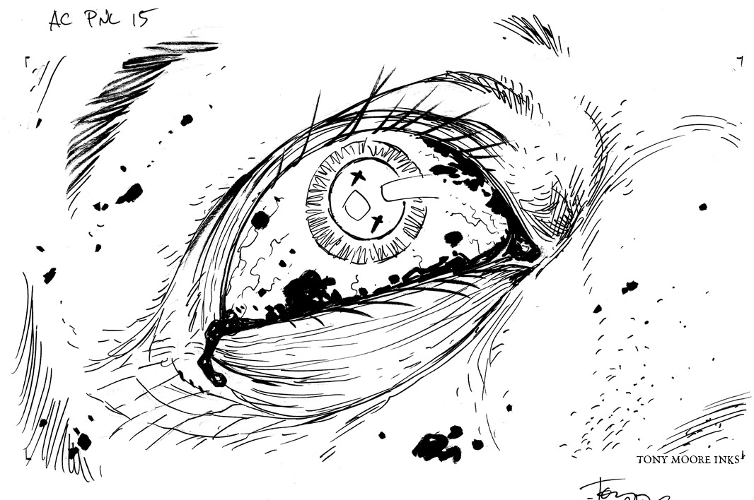
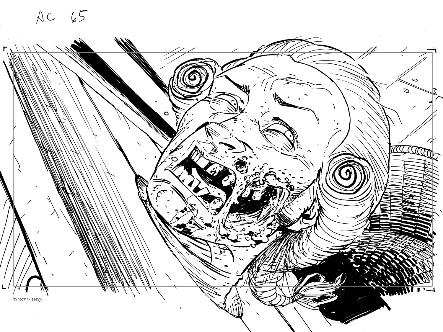
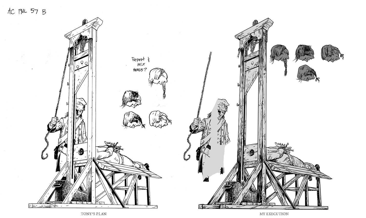
Last-minute edit of an eyepatch to match the storyboards. Also needed to do a 'before' scene of the neck. The sword is on another layer so it can start at the left.
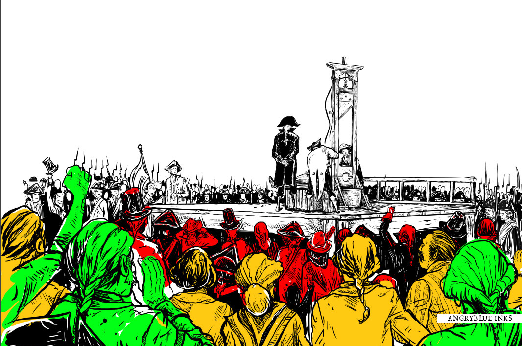
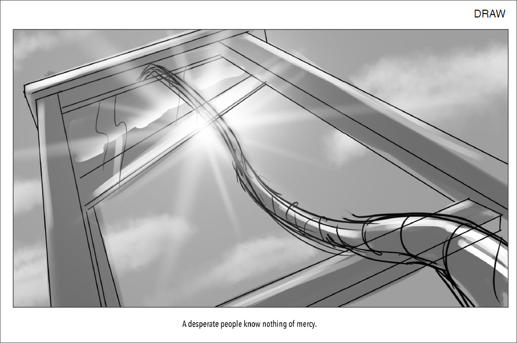
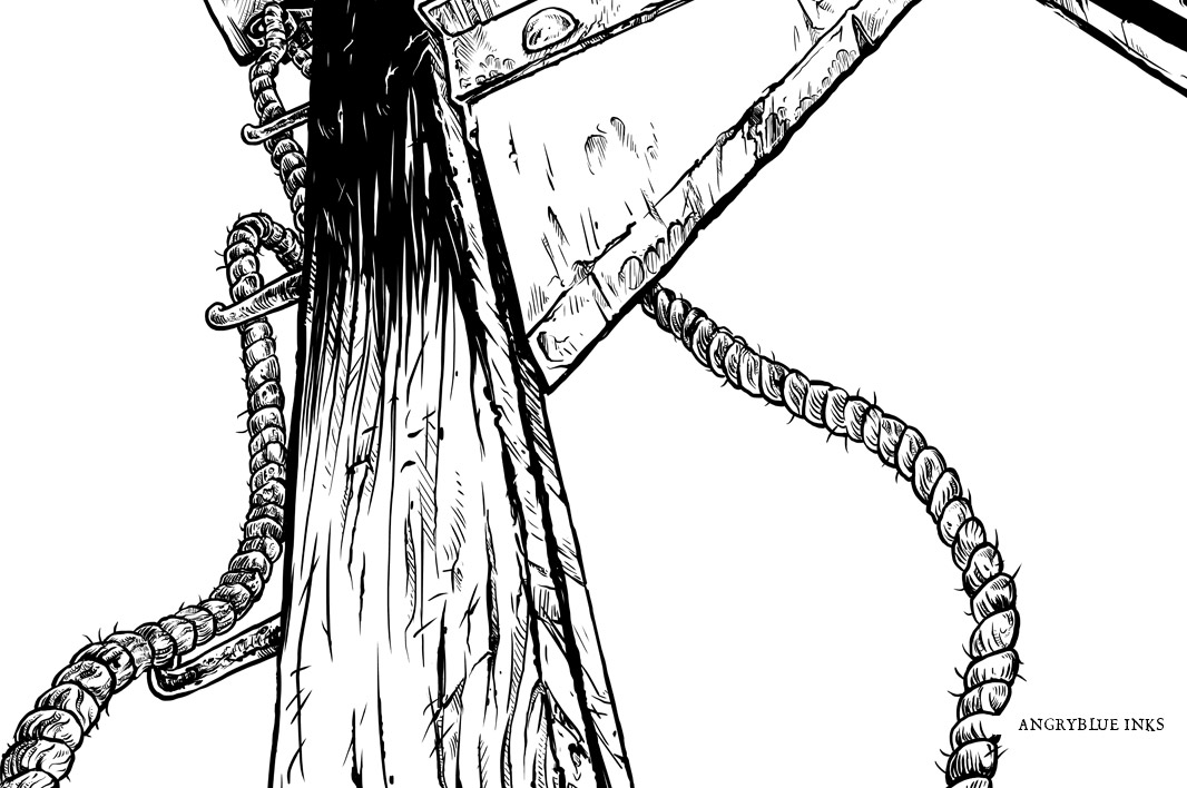
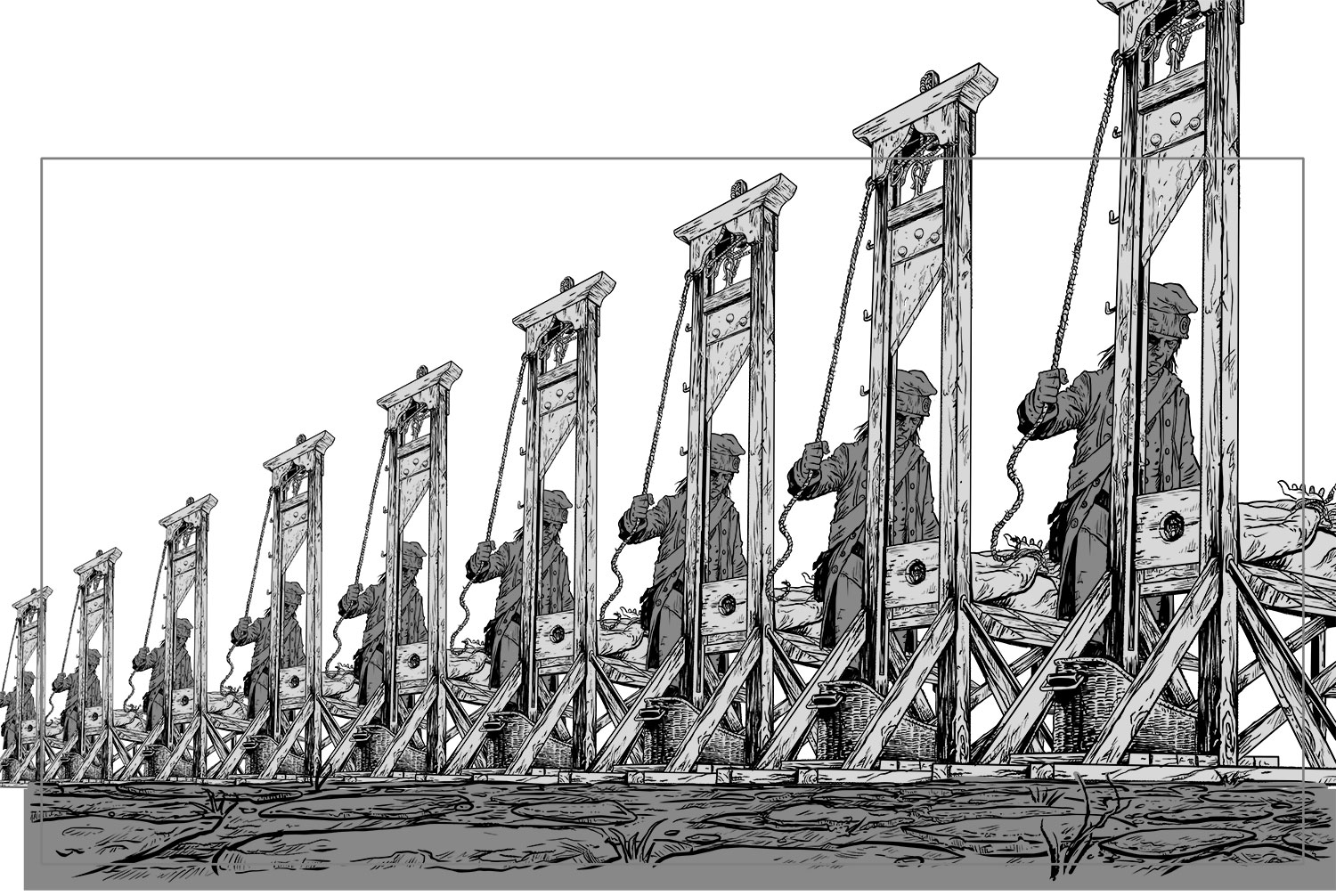
The idea for the story was fun. The French Revolution is one of the goriest times the world has had and has a great juxtaposition of decadent and elegant visuals tied together with poverty, desperation and grime. Not to mention one of the coolest ‘humane’ death sentences: the guillotine! OFF WITH THEIR HEADS!
This project was tons of fun and tons of work. Rob Zombie got on board, played with the idea of the story and came up with some great ideas. We got to talking and got the ideas sorted out. Storyboards were made and then it was go time. We had something like 5 weeks total to create an animated webcomic/short/whatever from the ground up.
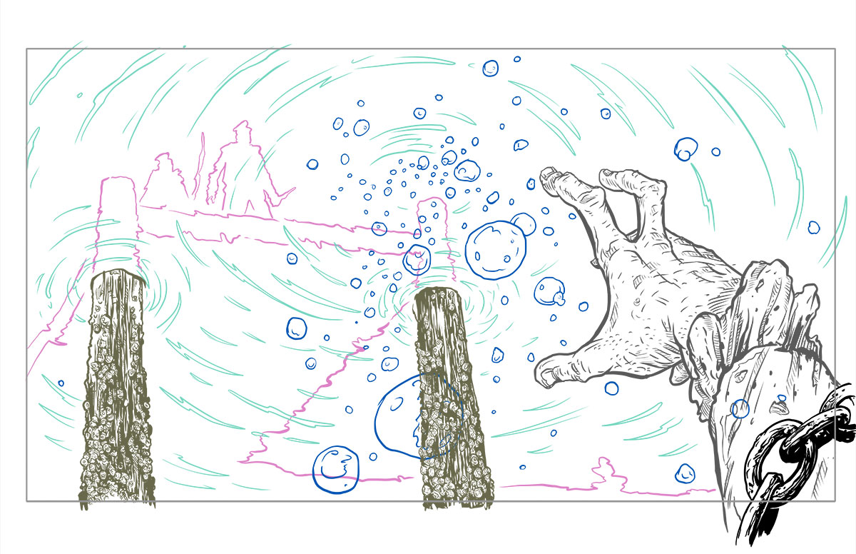
Tony fixed story telling issues in the panels on the storyboards, re-approached the sketches to make them more dynamic and started churning out drawings to me. He laid out all of the groundwork. Some of these things were rendered. Some were gestured for time and ... the problems were solved. When I do my pencils, I just solve all of the problems and then really needle in the meat of it when I ink.
I think it was really cool for both of us to know that we were looking at the same thing and if he gestured something, I knew how to interpret it with more flair or detail without having to have every finger articulated or as Tony said in the behind-the-scenes video, "he's probably the one other person I could hand it to who also knows what the cross-section of a human neck looks like." Plus visually, we have similar wheelhouses of style.
Maintaining both of our illustrative voices was really important to me.
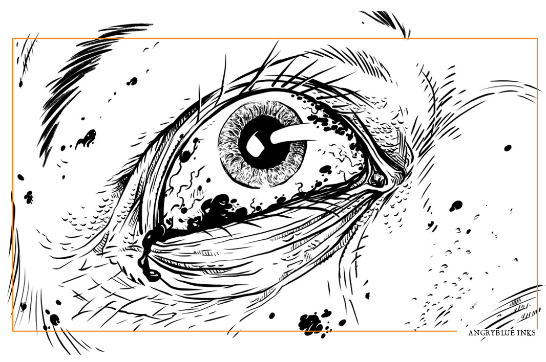
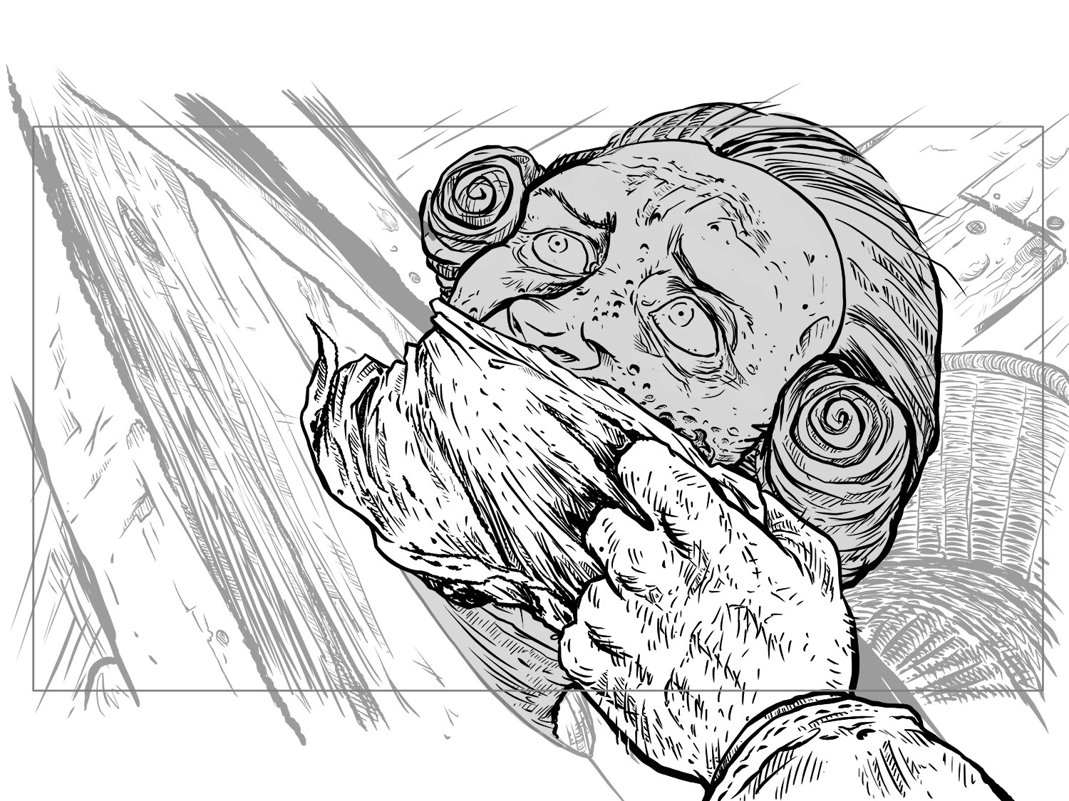
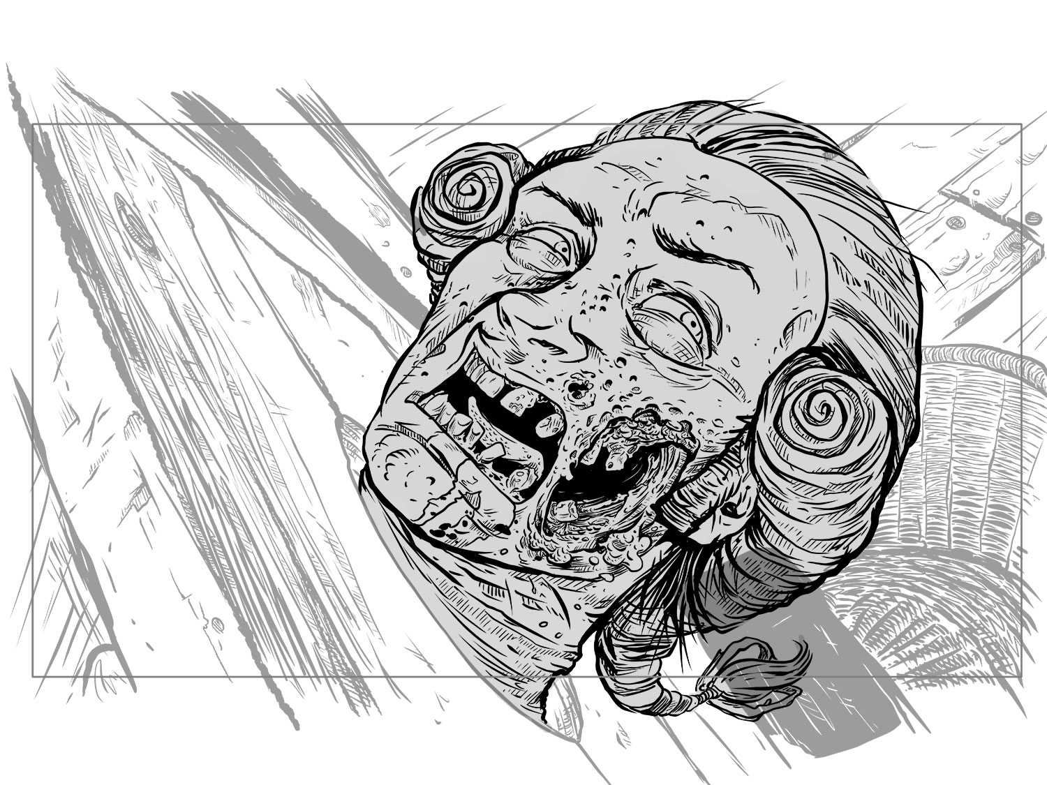
Since I knew we would be zooming into the executioner (my hero!), I drew him with even more detail so when the zoom happened, the quality would actually enhance instead of coming closer to fat beefy lines.
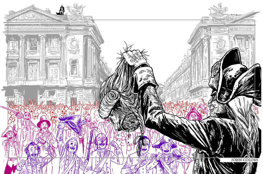
Normally, I do 90% of my work with pen and ink. However, to save up to 70 hours of scanning and cleaning up the linework, almost everything on my end was done in Manga Studio at 900dpi 18x24. Yeah. Seriously. While doing this, it was layered as much as possible to give the animators at New Science Agency some room to wiggle around instead of having to chop of something flat. This resolution also have them the opportunity to drop down, zoom in and add a ton of depth.
For Instance: if I had a figure, I would draw in more of the background so they could move it or whatever they needed to do for the scene without it having to be very obviously pasted in a clunky fashion.
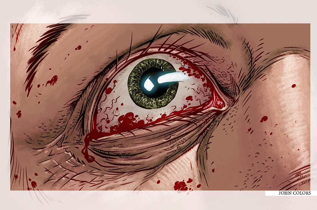
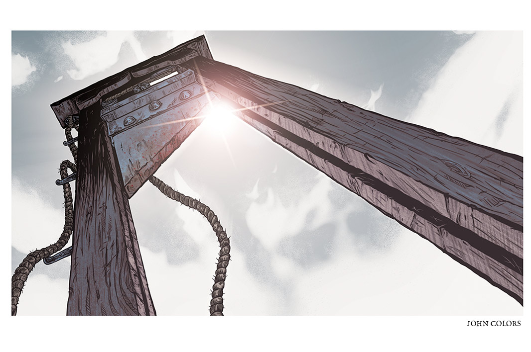
As my work was finished, it got handed off to John Rauch who is an artist and wonderful colorist I've known for over a decade, but have never worked with. Every time we got a colored piece back from John, I was floored with how much more life it gave the work. For my posters, I'm used to working with a minimal palette. Seeing how quickly he could crank out things that had beautiful texture and lighting was really intense because of how I usually solve my lighting problems in the inking stage.

i love being able to play with this sort of texturing. It's a rad adaption of the overal series branding to fit with this theme, so playing on top of that was fun.

To wrap up the whole project, Tony and I designed a screenprinted poster. 500 limited edition silk-screened posters that were distributed at the ‘Assassin’s Creed Unity Experience’ outdoor obstacle course at Comic-Con. The poster features Unity’s hero ‘Arno’ in front of a stained-glass window peppered with images from the animated short. Each poster was numbered and signed by the artists.
Basically, we landed in San Diego and went, “oh crap. We have to sign 775 posters”
We will each have 100 available from the run. They are signed by both of us.
Mine are available on my website: Angryblue.com as of 7.30.2014
There’s a detailed write-up of the process here at my Behance portfolio.
Also: Behind the Scenes!